
One of the most underrated yet frequently used features on a smartphone is the volume slider. Whether you’re adjusting sound for videos, games, alarms, or music, it’s a small detail that shapes your daily user experience. With the arrival of Android 16, Google is bringing massive changes to Android’s design language with Material 3 Expressive. Among these changes lies a potential redesign of the Android 16 volume slider—and it looks surprisingly similar to the way Apple’s iOS handles volume controls.
This subtle yet impactful tweak has already sparked debates: is this just evolution, or is Google borrowing a little too much inspiration from Apple? Let’s break down what’s changing, why it matters, and what it could mean for the future of Android’s design philosophy.
The Evolution of Android’s Volume Slider
Over the years, Android’s volume slider has gone through multiple visual and functional revamps:
- Android 9 Pie introduced the vertical slider on the right edge of the screen.
- Android 12 (Material You) refined the look with rounded edges and wallpaper-based color theming.
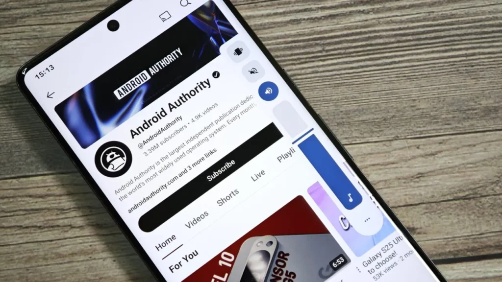
- Android 16 (Material 3 Expressive) adds playful bounce animations, a new stream icon at the top, and morphing buttons that transform into waveforms during media playback.
Now, with the QPR1 (Quarterly Platform Release) build of Android 16, we’re seeing an experimental design that positions the volume slider more like iOS, adjusting itself based on screen orientation.

The iOS Approach to Volume Controls
Apple has kept a relatively consistent approach to volume controls over the years. On iOS:
- In portrait orientation, the volume slider is vertical, aligned along the left side of the screen.
- In landscape orientation, the slider automatically switches to a horizontal bar displayed at the top-center of the screen.
This makes sense for usability—especially while gaming or watching videos—since it avoids covering important screen content. Many Android users have long admired this adaptive design, and it looks like Google has taken notes for Android 16.
The New Android 16 Volume Slider Design
In Android 16 QPR1, the redesigned slider is positioned vertically on the right edge of the screen, making it comfortable to reach during one-handed use. This central placement benefits tall, narrow smartphones, but it poses challenges:
- In portrait mode, the slider feels natural and intuitive.
- In landscape mode, however, the vertical slider can obstruct visuals in movies, games, or even navigation apps.
This is exactly the issue Apple already solved, and it seems Google’s Material 3 Expressive design experiment might be aiming toward adaptive orientation-based layouts, similar to iOS.
Why Google Might Copy iOS on Volume Control
Google often emphasizes individuality in design with Android, but there are times when practicality wins over originality. Adopting a more iOS-like approach to the volume slider makes sense because:
- Better usability: Reduces interference with on-screen visuals during landscape use.
- Consistency across devices: Works equally well on phones, tablets, and foldables.
- User feedback: Android’s feedback ecosystem often highlights usability friction, and this tweak directly addresses that.
It’s not unusual for Google and Apple to take inspiration from each other—after all, features like widgets, always-on display, and even gestures have flowed both ways in the past.
Material 3 Expressive and the Bigger Picture
The volume slider revamp is part of a broader Material 3 Expressive push. This update is focused on making Android more visually playful, intuitive, and emotionally engaging.
Along with the redesigned slider, users are also getting:
- Springier animations that react with subtle bounce effects.
- Dynamic colors that adapt more clearly to contrast needs.
- Typography hierarchy for better readability.
- Shape morphing elements that transition fluidly.
- Quick Settings upgrades with resizable controls.
This makes even minor UI updates—like the volume slider—blend naturally into an evolving design philosophy.

Android vs iOS Volume Slider: A Quick Comparison
| Feature | Android 16 (Current) | iOS 17 (Current) |
|---|---|---|
| Portrait Mode | Vertical slider on right side | Vertical slider on left side |
| Landscape Mode | Vertical slider stays (may block screen) | Horizontal slider at top-center (non-intrusive) |
| Animations | Bounce effects, waveform morphing | Smooth fade-in animation |
| Customization | Themed with Material colors | Fixed Apple styling |
| Reachability | Easy for right-handed users | Easier for left-handed users |
Pros and Cons of the New Volume Slider
✅ Pros
- Adaptive usability could improve media and gaming experience.
- Matches modern screen ergonomics (tall smartphones, foldables).
- Brings closer parity with iOS usability.
- Integrates better with the playful style of Material 3 Expressive.
❌ Cons
- Might reduce Android’s visual uniqueness if it feels too “iOS-inspired.”
- Vertical placement in landscape still feels awkward unless orientation-based switching is added.
- Frequent UI changes can confuse casual users.
- Left-handed users may still prefer iOS positioning.
What This Means for Users and Developers
For users, this redesign could mean fewer frustrations while consuming media in landscape mode. For developers, the availability of new Material Motion APIs ensures consistent implementation of expressive transitions, giving more apps the ability to sync their UI with the new volume slider aesthetics.
This also hints at a future where Android continues to refine functionally essential details—like controls, sliders, and buttons—by borrowing the best practices from the competition while layering its own unique touches.
Final Thoughts
The Android 16 volume slider redesign may look like a small change on the surface, but it showcases Google’s ongoing efforts to refine the daily smartphone experience. By possibly adapting orientation-aware volume controls inspired by iOS, Android is making strides toward practical usability while maintaining expressive design flair.
For users, it means smoother, smarter sound control. For developers, it signals the importance of designing apps that feel in tune with Google’s shifting design philosophy. And for the smartphone ecosystem as a whole, it’s another example of how even rival platforms often inspire each other in the relentless pursuit of better user experience